Earl Grey, New Look – 2
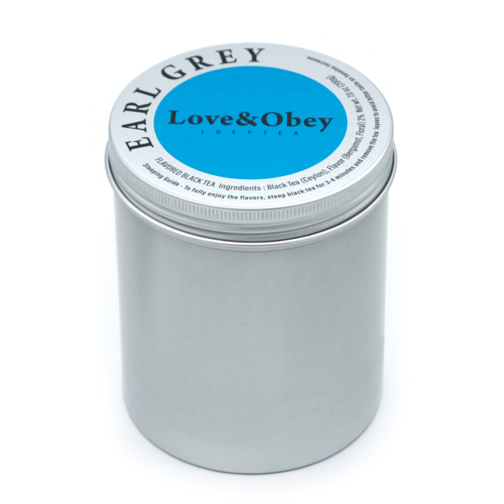
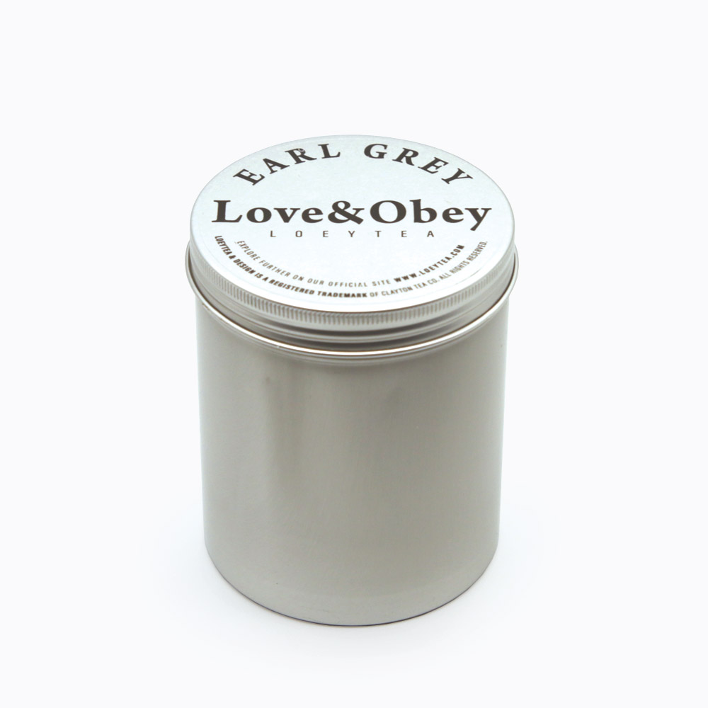
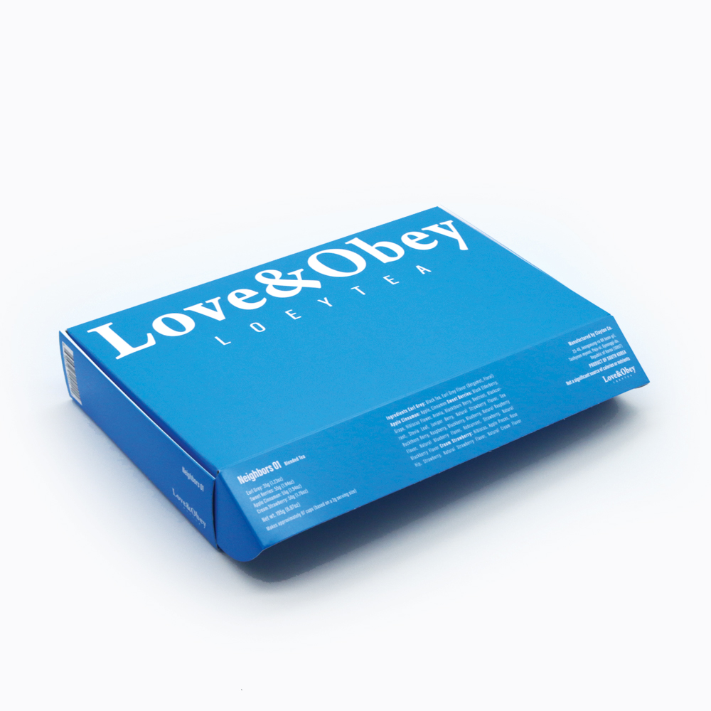
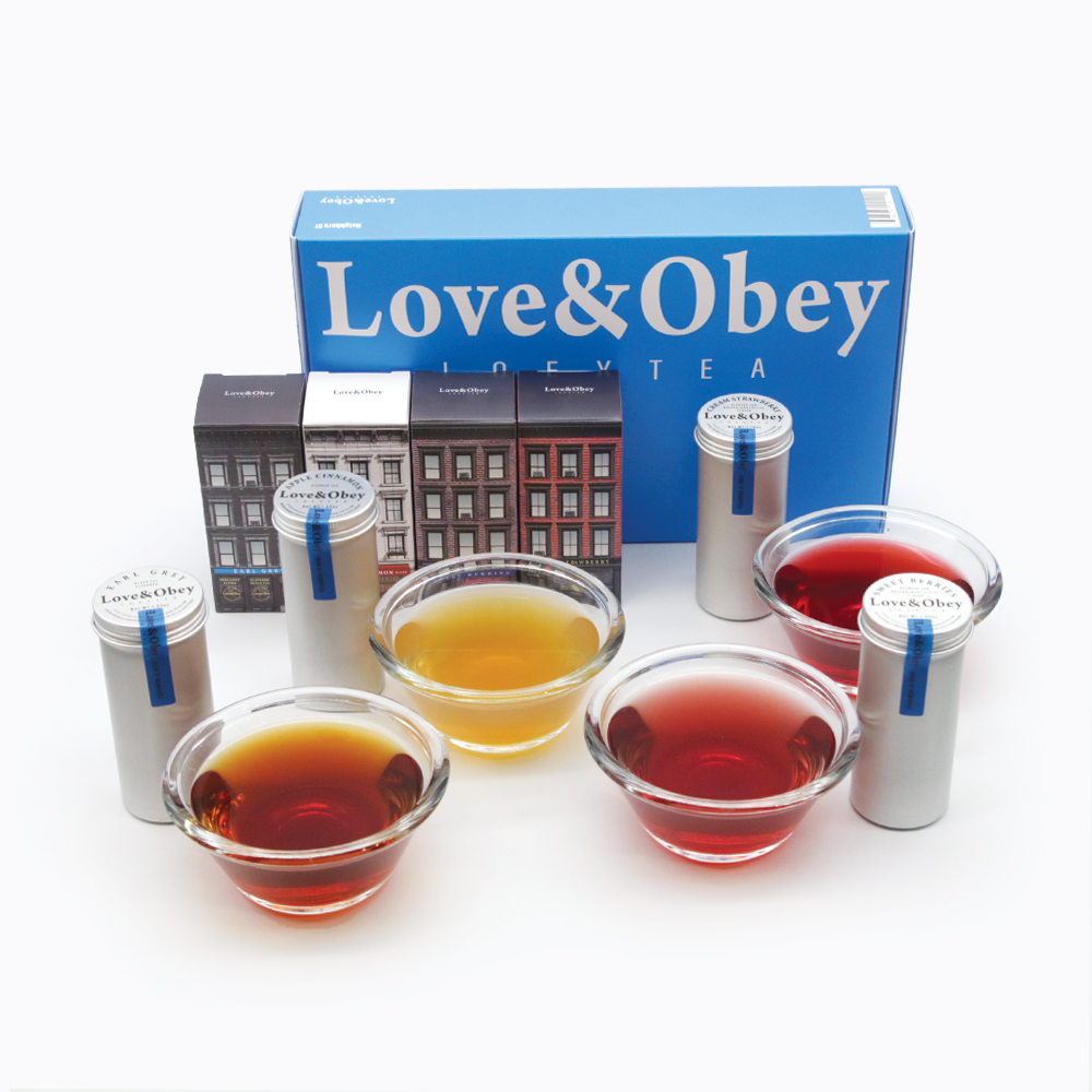
The new Earl Grey design.

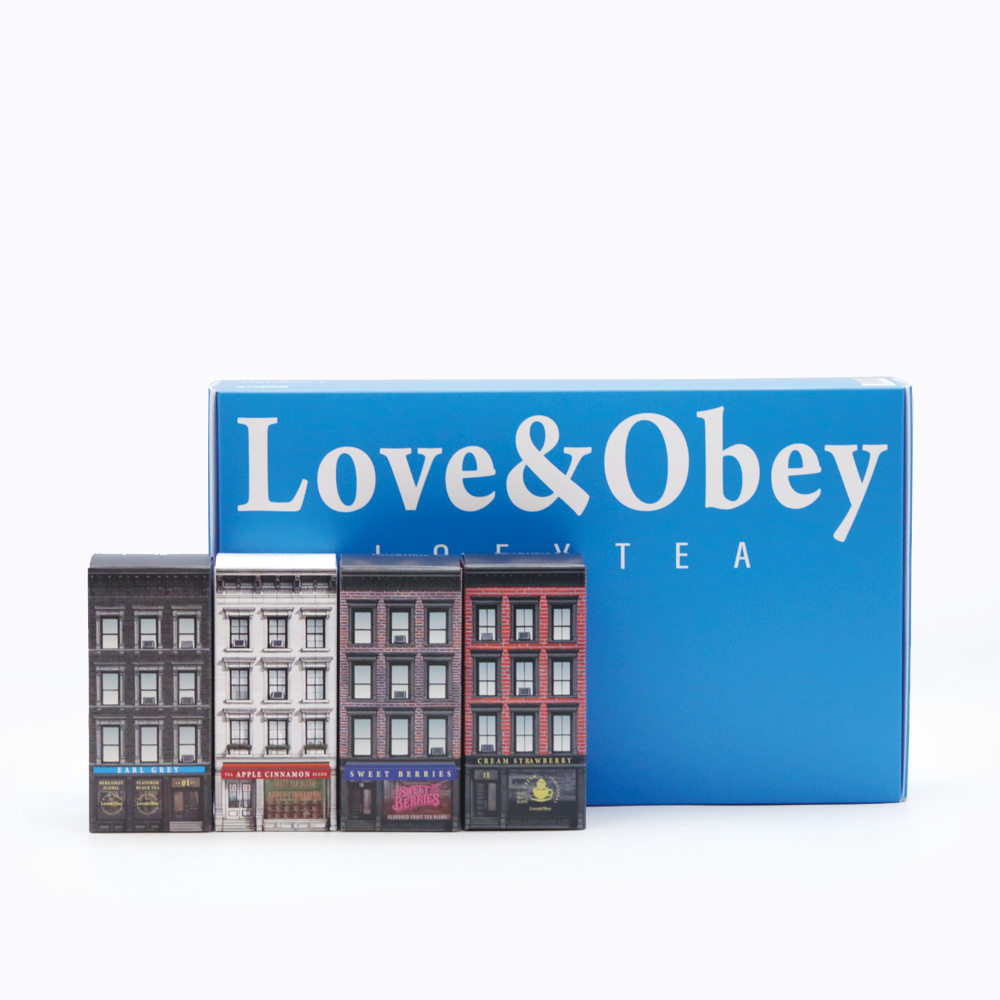
At the end of 2024, we discontinued our previous brand and introduced a new concept that aligned with our desire to work with aluminum materials. The initial design focused on highlighting our logo while distinguishing each variant by its name. Given the limited time, simply finding the right material and engraving our name onto a circular form was a joyful accomplishment.

The exhibition in the U.S. is both a showcase of our efforts and a milestone that drives us to create something new in alignment with the schedule. Presenting our latest work to new audiences is an incredibly exciting experience.

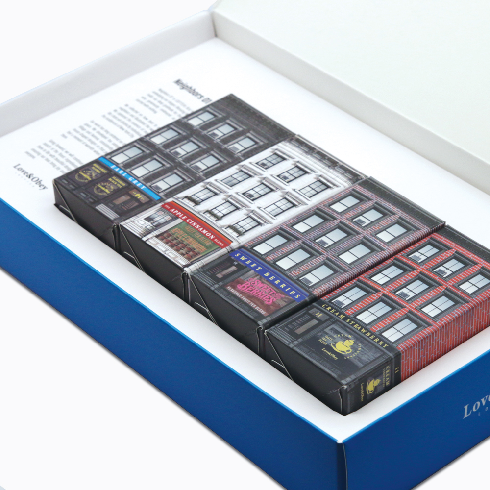
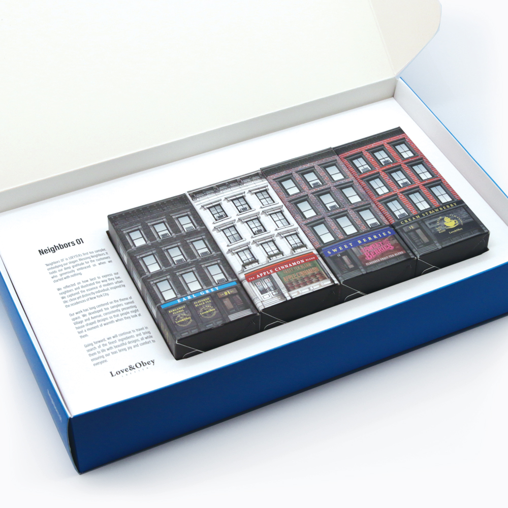
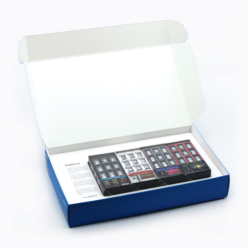
From the very beginning, we have believed in sourcing the finest ingredients and presenting them in beautiful packaging. Defining a theme and delivering something aesthetically pleasing into the lives of our customers brings us great joy. Design offers endless possibilities for expression, but what we seek to convey is form and typography.

The impression created by a simple yet weighty form and its texture, combined with the shapes of letters—humanity’s means of communication—are at the heart of our approach. Stripping everything down to its essence and arranging it for effortless recognition requires deep thought and meticulous effort. We have dedicated years to ensuring the highest quality ingredients and designs that suit the modern living space.

In the next version, we may extend the design to the side panels, but for now, after extensive sketches and prototypes, we have arrived at this final form. The interplay of empty space with the static yet subtly dynamic top design effectively accentuates the cylindrical shape.

Earl Grey, New Look

We have always focused on creating products that bring beauty into everyday life. For our Earl Grey tins, we embraced a modern minimal design approach, using screw-top aluminum cans to ensure airtight sealing.

The current label was designed in alignment with our brand identity for the Las Vegas trade show in March 2024. It featured a minimalistic concept, with a focus on the metallic texture and a simple presentation of the tea’s name. The design served as an introduction at the exhibition, allowing us to gauge customer reactions. Now, following the launch of our first sampler, it’s time for a renewal.

We aim to preserve the raw beauty of the metallic body as much as possible. After testing numerous label designs, we found that leaving the surface clean and minimal best reflects the essence of our aesthetic.

Our Earl Grey tea has been a customer favorite for nearly a decade, earning our trust and confidence. We are now refining it further—making it more beautiful and better suited for the modern, urban lifestyle.

Coming soon.

Love&Obey LOEYTEA, Neighbors 01

A Tea Sampler That Shares the Warm Stories of Neighbors

At LOEYTEA, we believe that a simple cup of tea can be more than just a drink—it can bring small moments of happiness into everyday life. Our first tea sampler, Neighbors 01, was created with this hope in mind. Featuring four premium blends, this beautifully crafted tea set is the perfect gift for friends, family, or any tea lover.

Blessing Neighbors

“Blessing Neighbors” is more than just a slogan—it reflects our gratitude to those who supported us during our humble beginnings. When we started from scratch, there were people who chose us, and their trust and encouragement shaped who we are today. Neighbors 01 is our way of expressing heartfelt appreciation for their role in our journey.

Shaping Neighbors

In the past, we’ve created collections like Avenue and Village, inspired by various spaces. This time, we wanted to capture the essence of “neighbors” through the concept of houses, which led us to the iconic red brick buildings of New York.

Modern Neighbors

New York’s red brick houses beautifully embody the spirit of modern neighbors—unique yet connected, much like the way we live today. While people live independently, their lives remain intertwined in meaningful ways. This idea inspired the design of Neighbors 01, which celebrates the harmony and individuality of modern communities.

New York Red Brick

The tin case is the centerpiece of Neighbors 01. Crafted from screw-sealed aluminum, its tall, elegant shape was inspired by New York’s brick houses. While we initially considered using two tins to better represent the traditional house design, practical considerations such as cost and durability led us to the current single-tin format.

Gallery, Art in Life

Our signature color, Cyan Blue, is one of the key printing colors used worldwide and represents our philosophy of staying true to the basics. With a desire to bring beauty into daily life, we designed Neighbors 01 with a gallery-like aesthetic. This tea sampler isn’t just a product—it’s an artistic expression meant to add value and beauty to your everyday moments.

Neighbors 01

Neighbors 01 is LOEYTEA’s first tea sampler, sharing the warm stories of neighbors. Like New York’s brick houses, it captures the beauty of individuality and connection. We hope this collection brings a touch of warmth and joy to your life, just as our neighbors have done for us.

Experience the art of life with tea. Discover the heartfelt story of neighbors through Neighbors 01 by LOEYTEA.

Modern Minimal

Our brand embraces a ‘Modern Minimal’ design identity, focusing on clean and sophisticated aesthetics. This identity naturally emerged through the creation of our gallery-concept tea sampler, and we incorporate our signature color, cyan blue. As one of the four CMYK colors, cyan blue symbolizes our commitment to fundamentals and our vision of becoming a globally recognized brand with consistent messaging. In a modern world overwhelmed by complex content and information, we aim to simplify our message and focus on the essentials. Our packaging is made from aluminum, prioritizing sustainability, with minimal printing and stickers to maintain a refined look.