
THEME
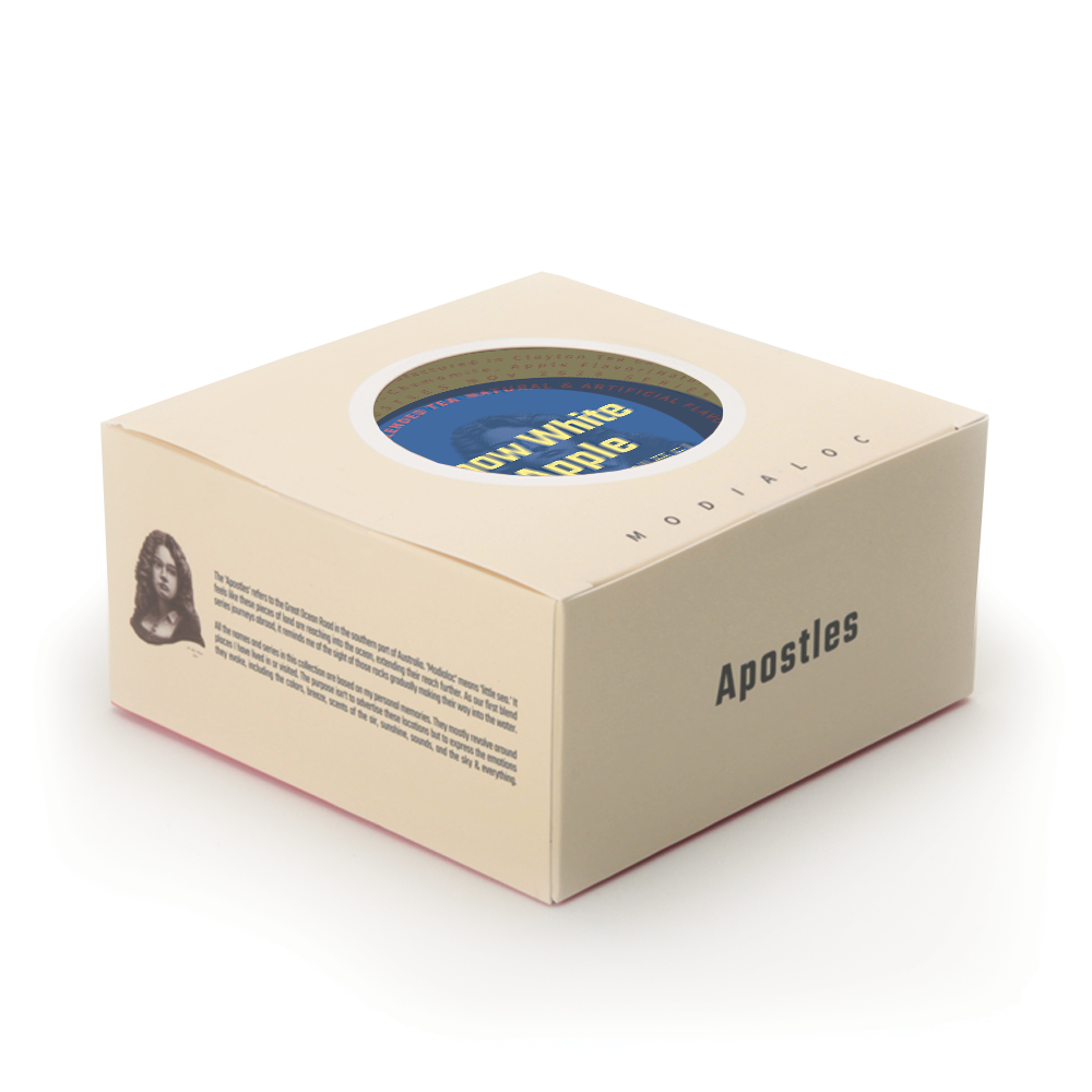
The ‘Apostles’ refers to the Great Ocean Road in the southern part of Australia. ‘Modialoc’ means ‘little sea‘. It feels like these pieces of land are reaching into the ocean, extending their reach further. As our first blend series journeys abroad, it reminds me of the sight of those rocks gradually making their way into the water.
All the names and series in this collection are based on my personal memories. They mostly revolve around places I have lived in or visited. The purpose isn’t to advertise these locations but to express the emotions they evoke, including the colors, breeze, scents of the air, sunshine, sounds, and the sky & everything.
About Design
Desiring beauty, a memorable, and iconic design is a common aspiration for everyone working in the field of design. Good design often derives its inspiration from nature and fundamental principles. This is why it frequently relies on simple shapes, like squares, circles, lines, and letters.
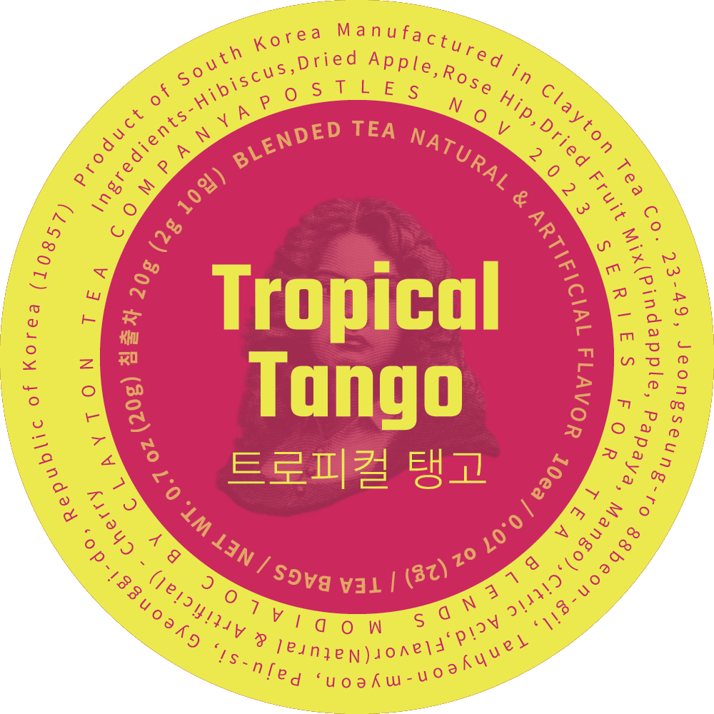
A circle conveys a sense of the universe and the world, making it an ideal choice to create a distinctive series of blends. We aim to ensure that this series is captivating and stylish. Magenta is the primary color of Modialoc, one of the four fundamental colors for printing. While we have used this color in most of our packaging, for our blends, we embrace a broader spectrum of colors. For the outer box, we’ve opted for a creamy color to emphasize the individual blend colors within the circle. Upon opening the box, you’ll discover another color that complements the core blend. We intend for these colors on the circles and letters to convey the flavor of the tea within. To accommodate the varying series, all relevant information is printed on the circle.
RELEASED
2018
BRAND
Apostles | Tea Blends Series